Yelloh

Brand Identity

Frozen FoodHappy

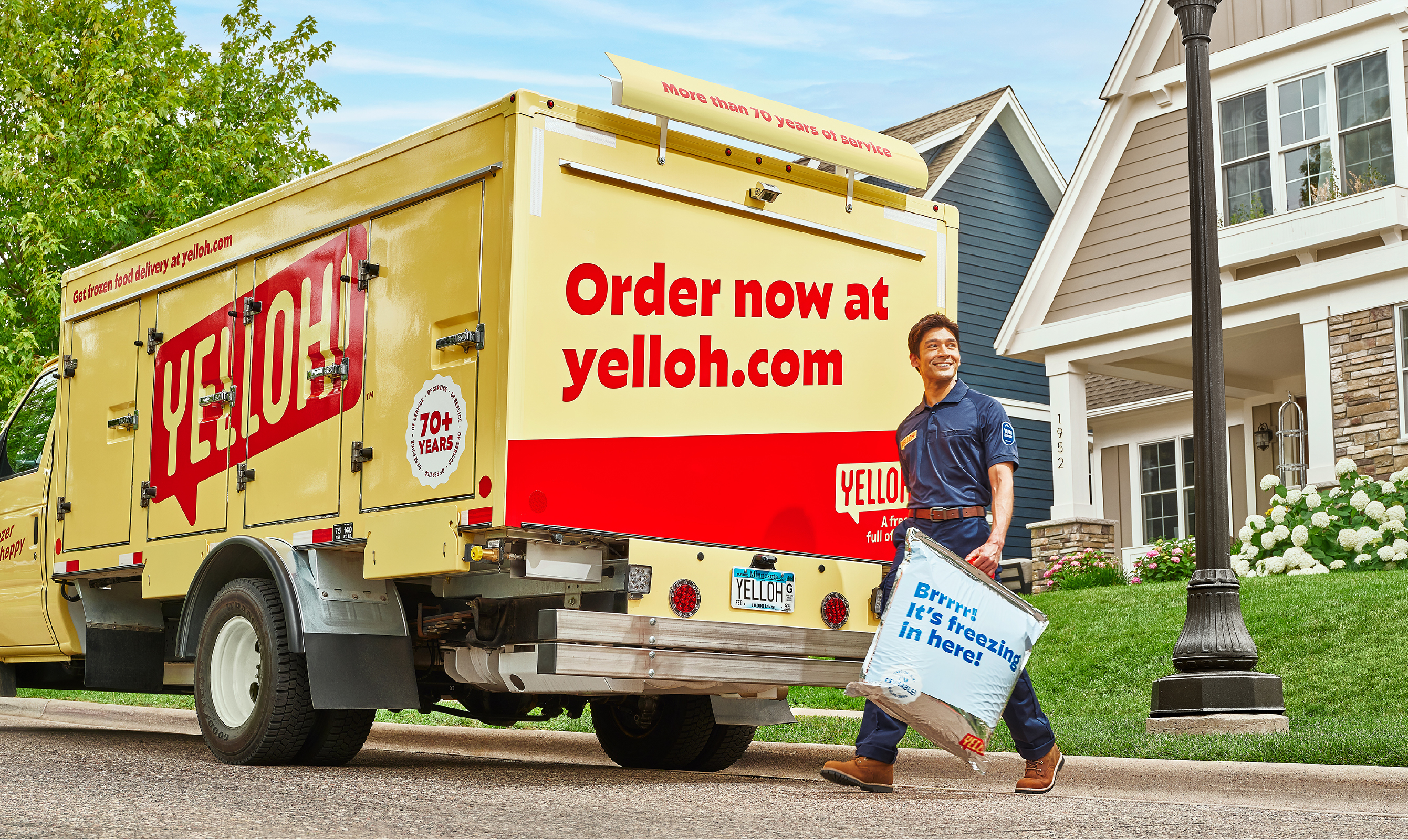
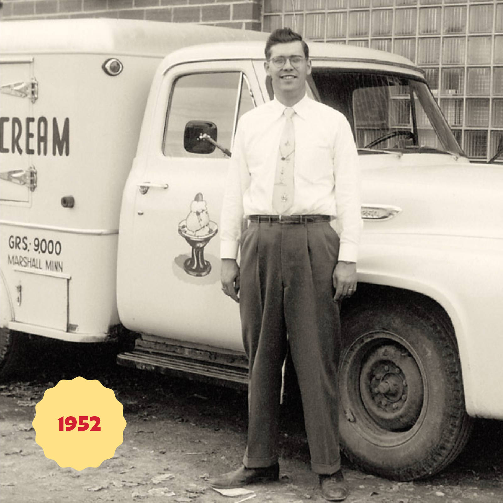
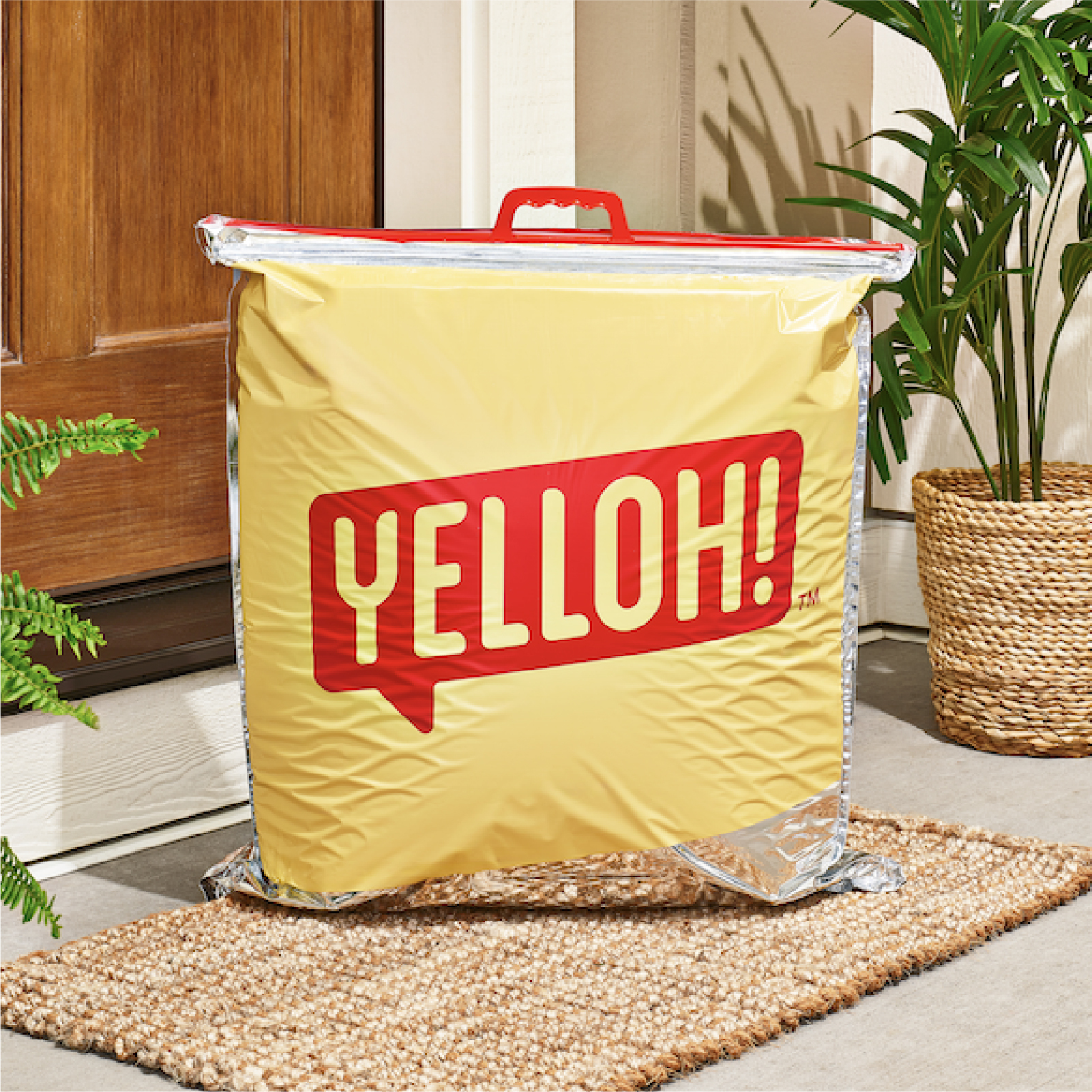
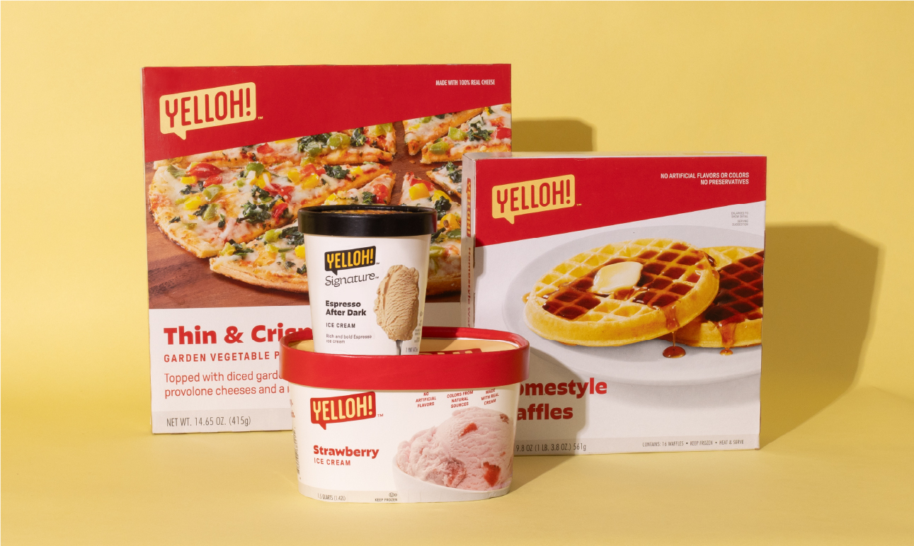
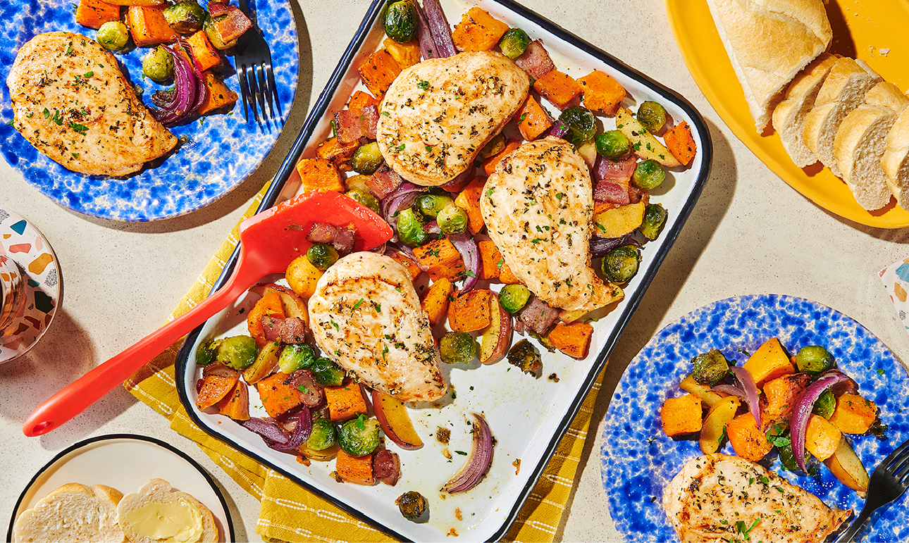
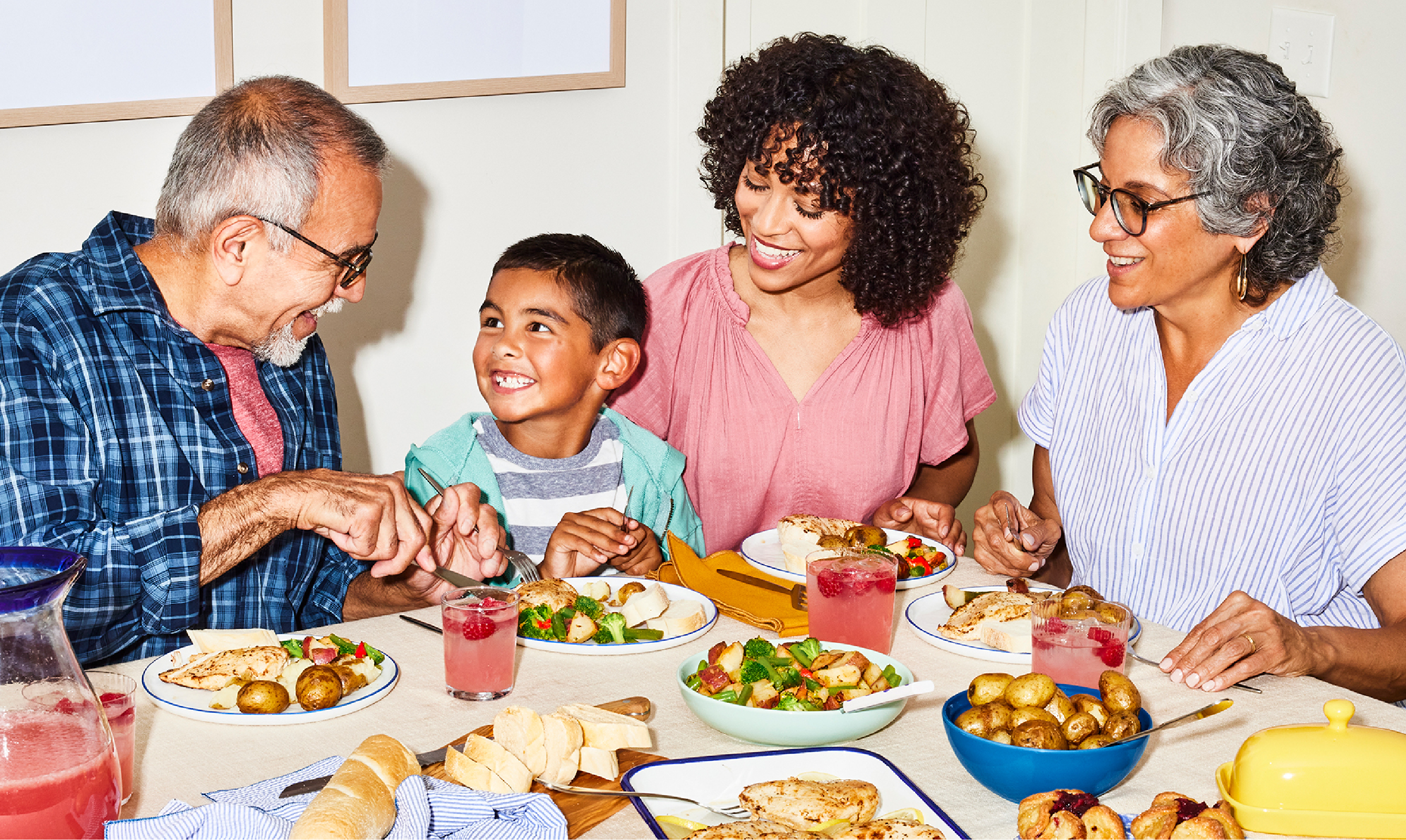
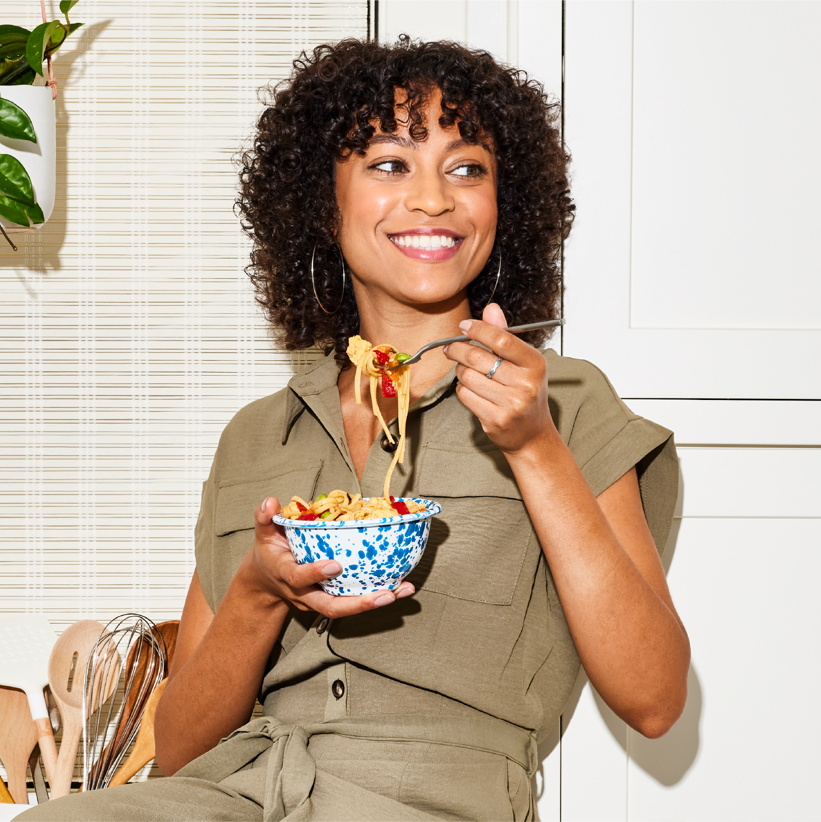
We embarked on a delicious transformation, breathing new life into a seasoned 70-year-old frozen food delivery company. We not only unveiled a fresh brand but also gave it a distinct new name and identity that nods to the company’s unique history. We designed the brand to be more relevant to the demands of today’s families, highlighting Yelloh’s mouthwatering offerings and personalized service—bringing a freezer full of happy to every doorstep.

As the original frozen food company since 1952, Schwan’s Home Delivery needed a new image to align with their new, modern offering. They entrusted us to not only rebrand, but rename their beloved, family-owned company. People familiar with Schwan’s Home Delivery often refer to it with a nostalgic glimmer; we aimed to bring the brand to the present, while positioning it to create memories for a new generation of consumer.
Yelloh 10 Thousand Design 2 Driver Historical
As the original frozen food company since 1952, Schwan’s Home Delivery needed a new image to align with their new, modern offering. They entrusted us to not only rebrand, but rename their beloved, family-owned company. People familiar with Schwan’s Home Delivery often refer to it with a nostalgic glimmer; we aimed to bring the brand to the present, while positioning it to create memories for a new generation of consumer.
Yelloh 10 Thousand Design 3 Logo
Why the name Yelloh? It’s a friendly greeting, the color of their iconic trucks, and now, it’s a great way to get a freezer full of happy.
The color palette pulls forward hues from the original brand while refreshing others to give Yelloh a modern feel. Angled blocks stemming from the logo are a core component of the graphic language and create dynamic layouts with a sense of movement — expressing how the brand efficiently delivers food to customers’ doorsteps.
Yelloh 10 Thousand Design 4 Colors
The color palette pulls forward hues from the original brand while refreshing others to give Yelloh a modern feel. Angled blocks stemming from the logo are a core component of the graphic language and create dynamic layouts with a sense of movement — expressing how the brand efficiently delivers food to customers’ doorsteps.

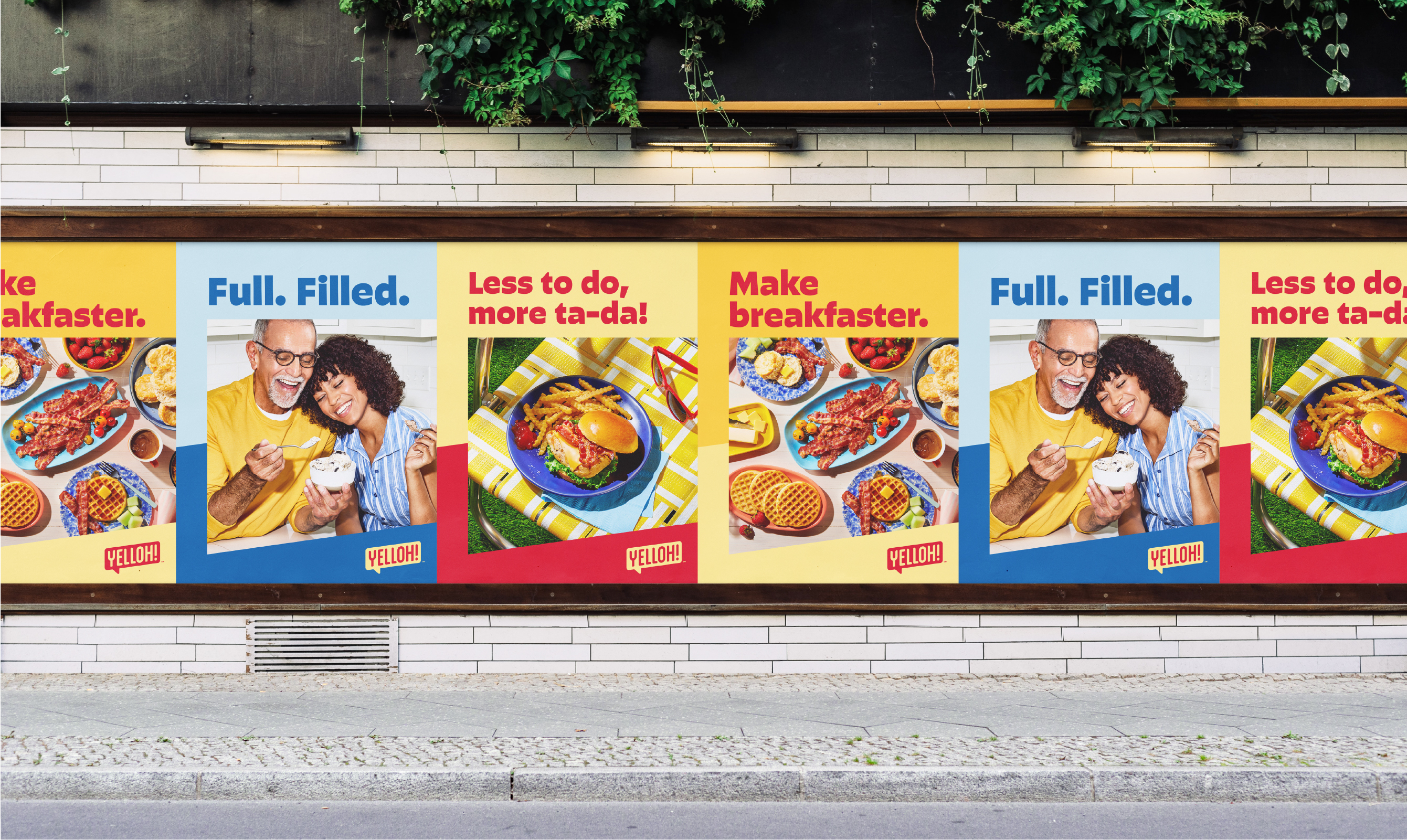
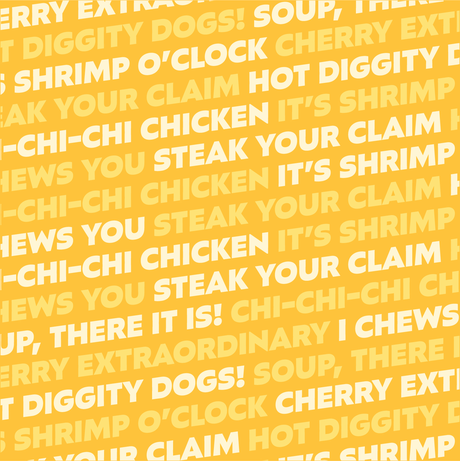
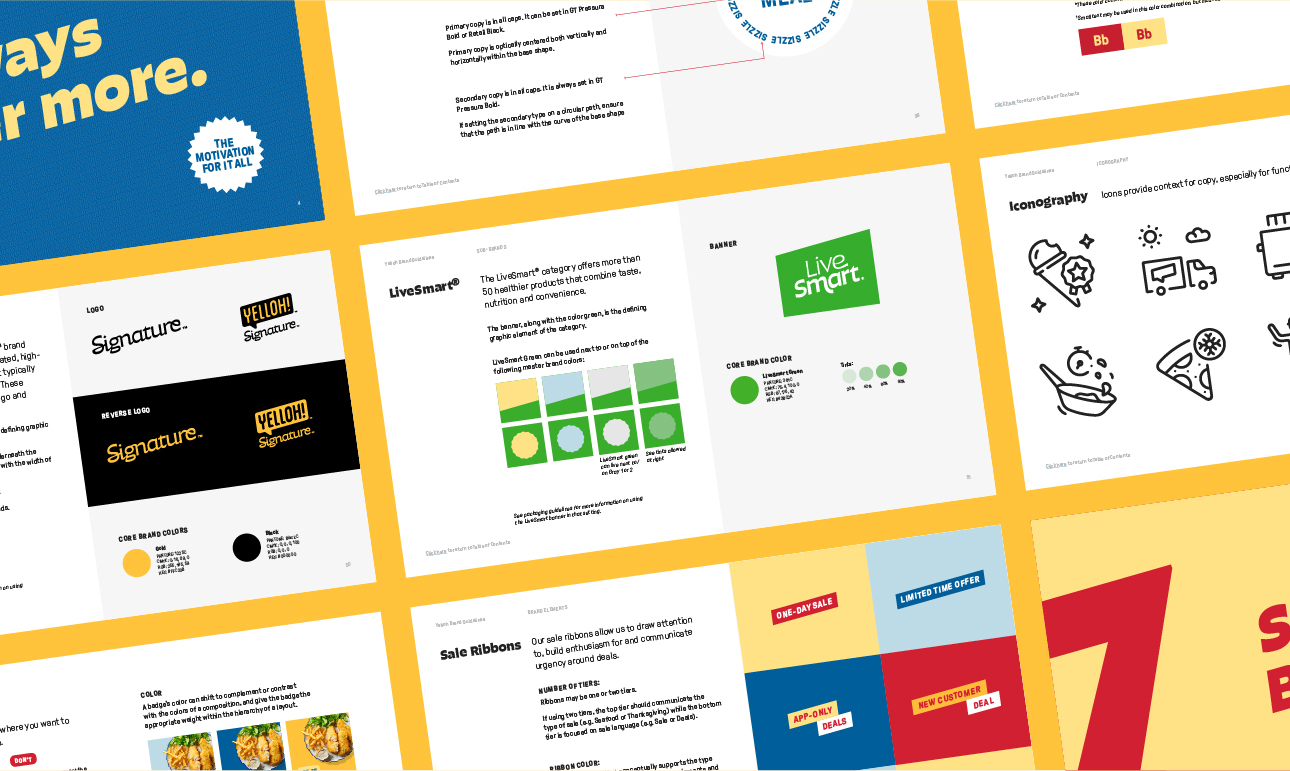
Typography is playful and bold — the perfect vessel for the brand’s revamped tone: fun, relatable, enthusiastic and knowledgeable.

Yelloh 10 Thousand Design 6 Social
Yelloh 10 Thousand Design 7 Uniforms
Yelloh 10 Thousand Design 8 Bag
The identity came to life in some of the brand’s most iconic assets including its legendary yellow delivery trucks, driver uniforms, freezer bags and packaging.
Yelloh 10 Thousand Design 9 Packaging
The identity came to life in some of the brand’s most iconic assets including its legendary yellow delivery trucks, driver uniforms, freezer bags and packaging.
Yelloh 10 Thousand Design 10 Badges

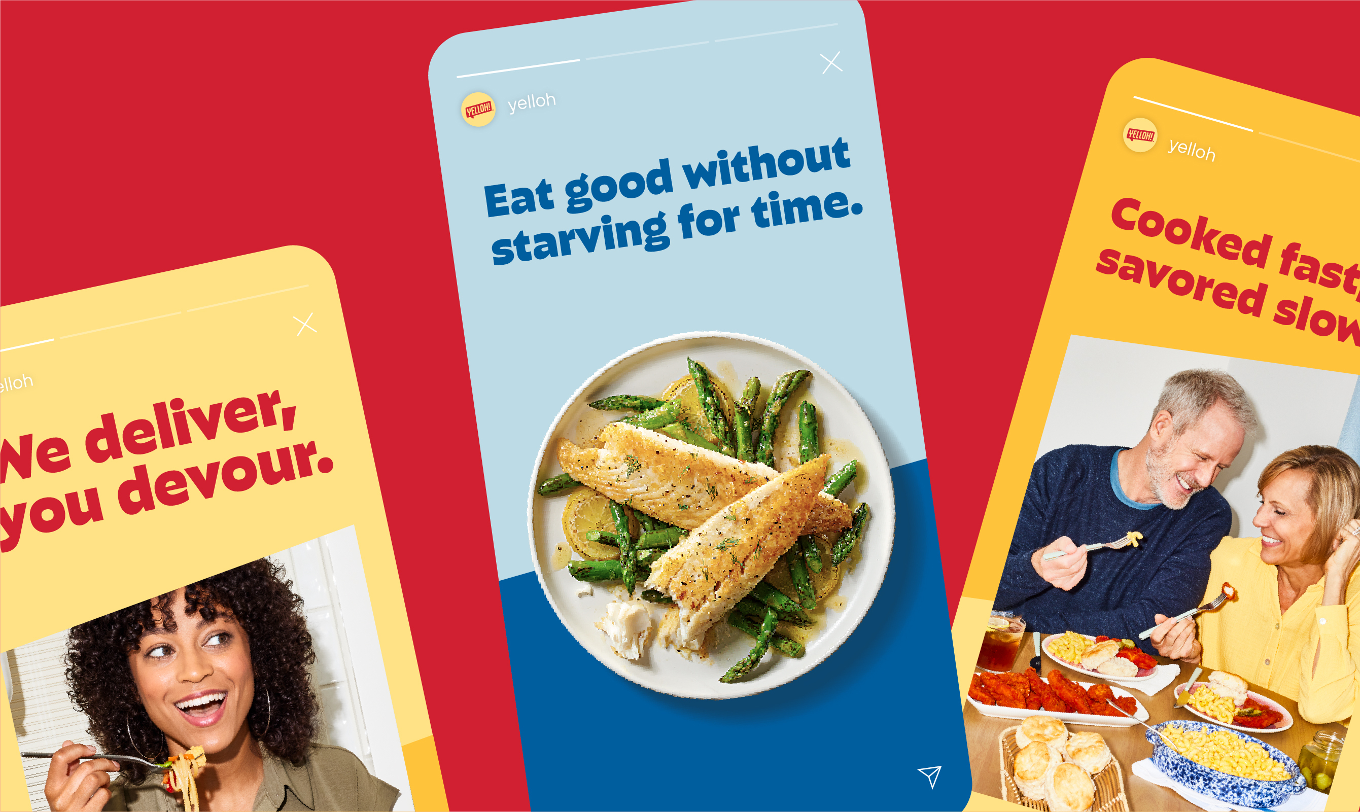
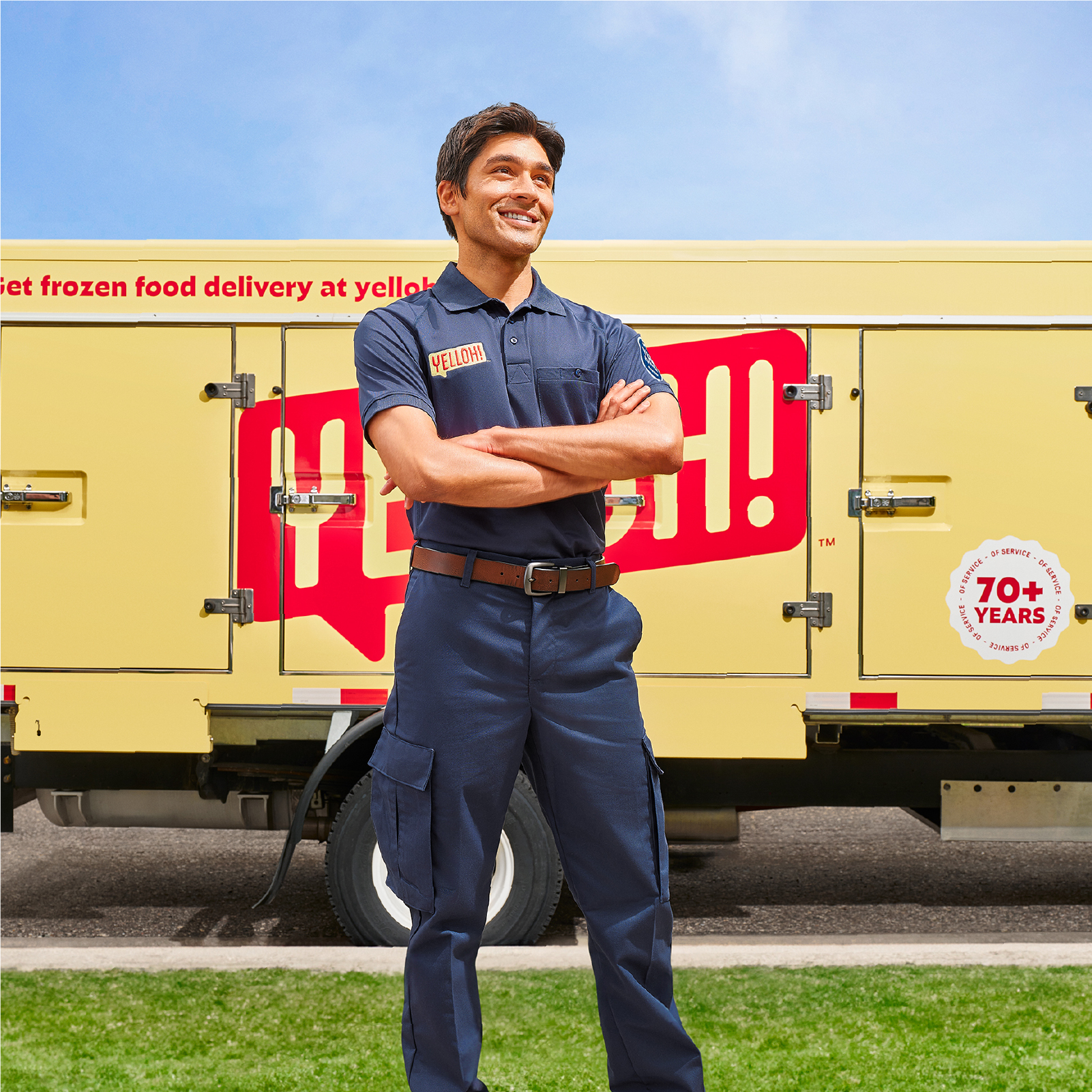
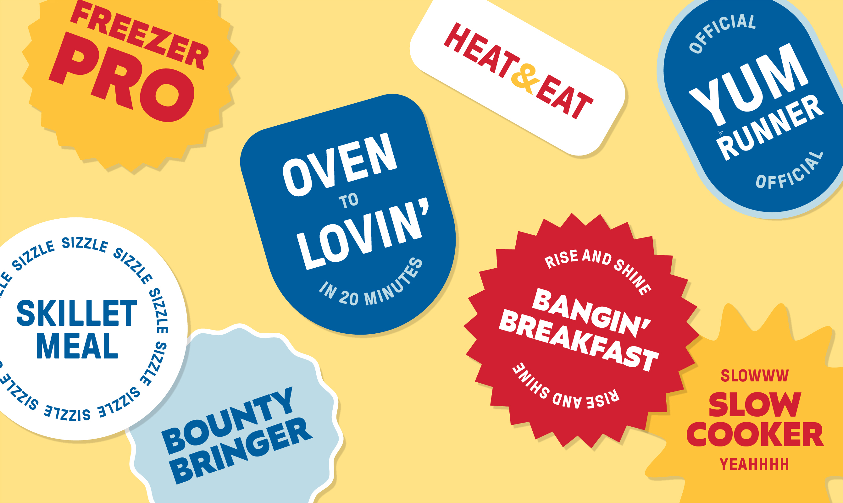
A system of badges highlights product offerings and the expertise drivers bring to customers' doorsteps.

Yelloh 10 Thousand Design 11 Pattern
Yelloh 10 Thousand Design 12 Pattern

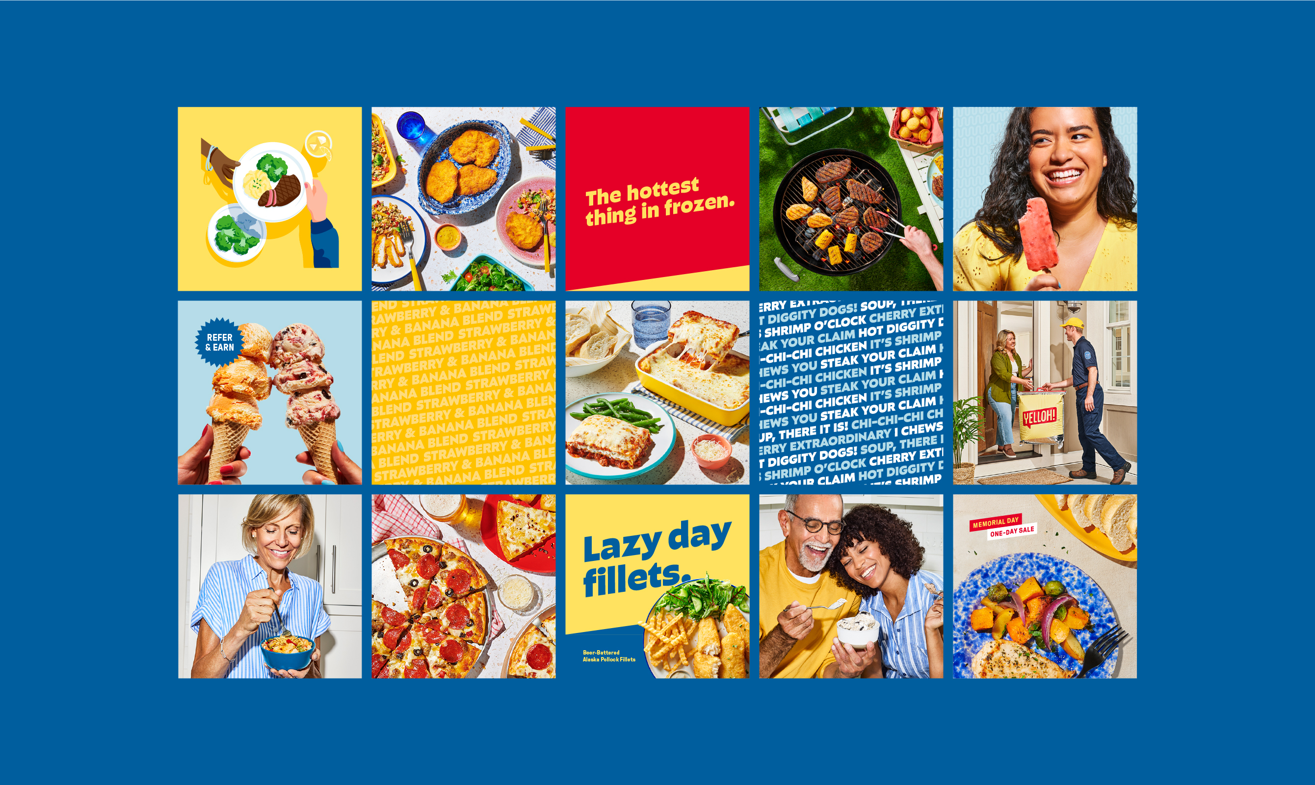
We developed the brand’s first illustration library to tell new customers the story of how Yelloh delivers a freezer full of happy.

Yelloh 10 Thousand Design 16 Food Photography
The food and lifestyle photography reflects relatable mealtime moments, complete with modern lighting style, refreshed prop library, and food styling that embraces life’s delicious imperfections.
Yelloh 10 Thousand Design 17 Lifestyle Photography
Yelloh 10 Thousand Design 18 Lifestyle Photography
Yelloh 10 Thousand Design 19 Lifestyle Photography

Yelloh.com is a modern leap for the original frozen food company.

Yelloh 10 Thousand Design 21 Style Guide
Yelloh 10 Thousand Design 22 Grid

From the first naming ideas to the final logo, there was so much collaboration and spirited discussion…thank you for your thoughtful creative and strategy leadership.

–Marketing Director, Yelloh

Client

Yelloh

Role

Naming, Brand Identity System, Web Design, Package Design, Brand Strategy
Top